- Aliases not bold any more
- Smaller improvements in various areas
- Bug fixes
Known issues:
- Outlook drag&drop crash
Known issues:
Hello everyone!
Thank you again for provided feedback on One Commander! There was a lot of quality feedback and I have been able to make the first alpha version of One Commander V2 by shaping your suggestions. I am sharing the progress with you. (Download at the bottom)
Installation – First big change is that One Commander now has a setup (There will be also portable version). I had to replace previous update system with a more robust technology. Installation now uses Microsoft’s ClickOnce method for deployment and it handles updates quite elegantly also. I have not yet purchased certificate so it will appear from an “Unknown Publisher”. One of the main reasons is that many users did not have proper .NET framework or other dependencies and the installer will install everything if necessary. Installer does not add any toolbars or other rubbish to your computer.
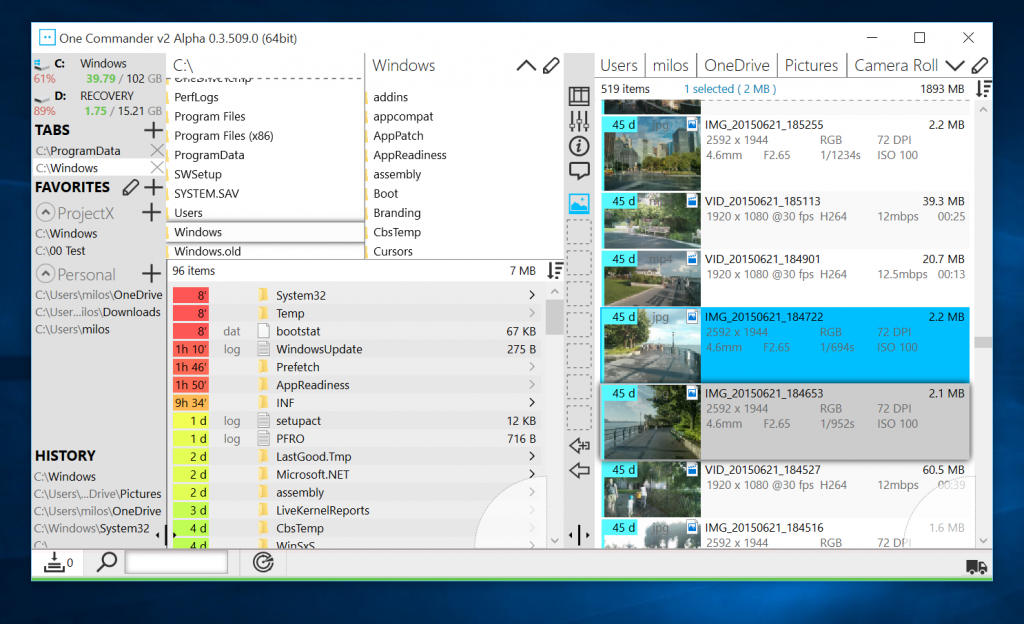
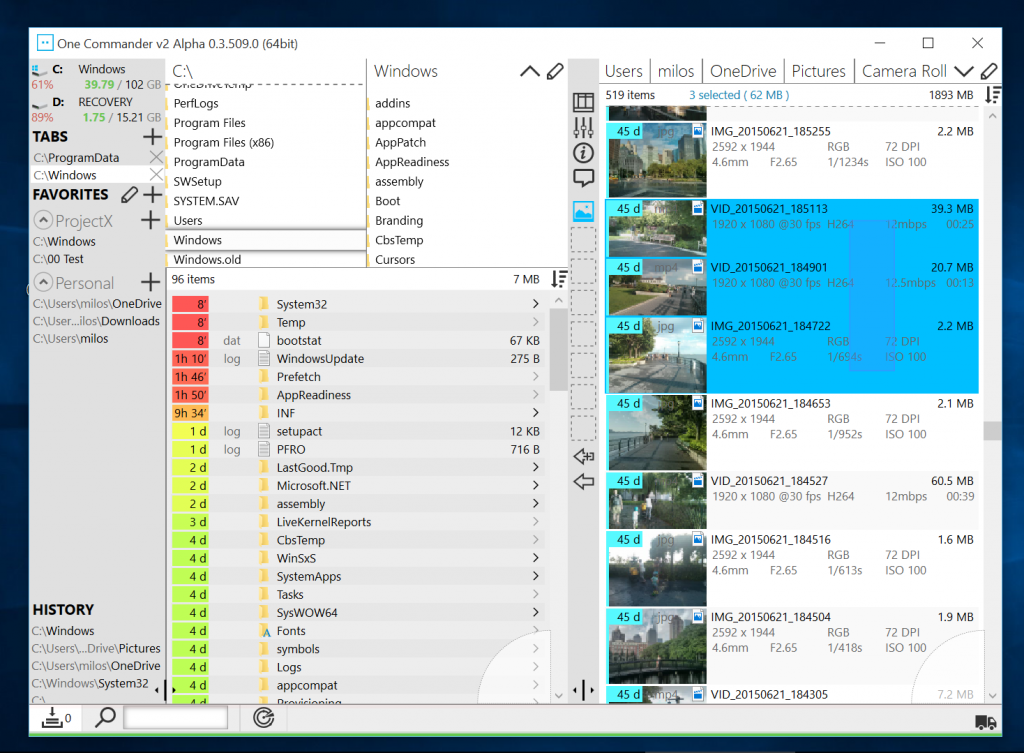
On the first start it will open in OCv1 Layout. The first thing you will notice is that vertical space is much better used. Panels now stretch to fit all available space and as you requested, panels closer to the current folder get more available space. If you are 4 levels deep the panel space distribution will be 1/8, 1/8, 1/4, 1/2.
Panel animation is now smoother but we can not have stacked panels look any more.
First panel is Drives and Favorites panel. There is no Special Folder section any more but Favorites now can handle multiple sections so you can make section and name it Special Folder if you are feeling nostalgic. You can create as many project based sections as you like and you can drag paths between sections or reorder within a section. Most requested feature was having Aliases so it has been implemented. Enable edit mode (pen icon) and button will appear letting you rename any Favorite.
One feature requested by majority was to merge files and folders in the same panel. You will see that listing files is now much faster. Total and selected files-size display is here again. Files sorting is just behind the information row and you can find it by hovering it with a mouse or using the sort button above the scroll bar. It is there so it does not take away valuable vertical screen space.
File Age colors have now a wider gamut and you can control saturation and luminance so you can make it pastel if you like. If you still prefer absolute dates, make file panel wide enough and these will appear.
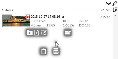
OCv2 has two context menus as described in previous posts. RMB (Right-Mouse Button) opens new context menu divided into 4 sections Create, Open, Clipboard and Modify. It does not rely on Windows shell so it opens instantly. If you still need a function from Windows Shell Context Menu, you can open it with Shift+RMB.
DUAL PANE
You might be familiar with Dual Panel workflow from other Commander style file managers. Almost half of you liked the idea so it is also there. Look for the Layout button and select Two Panel option. Second panel will appear only if window is wide enough. You can copy selected file to the other panel with Alt+C, or move with Alt+M.
You can open Favorite in a second panel by holding Ctrl while clicking it.

Since there was no space for Miller-columns (for folders) in Two Panel Layout, it has been added above the file list. You can use the breadcrumbs-like path for navigation or you can expand it to a Miller-Columns folder browser.

File selection can be made with window selection using MMB (Middle Mouse Button). Draw selection rectangle without looking for empty space around files. If you prefer keyboard, hold Ctrl, move to different files with arrow keys and press Space bar to select/deselect.
Not all functions from v1 have been added. Currently are still missing:
Since this is still alpha version expect bugs and crashes. Please do not use it yet for any serious work. Taskmaster has had quite a few changes and it was not yet enough tested to be relied upon.
There is a feedback button in the program itself and the more you use it, the faster there will be a final release version. You can also use OCv2 section on the forum or send me an email to support (at) this domain.
Download alpha version at:
http://onecommander.com/OneCommanderV2Alpha.zip
Enjoy!
OCv2 is still in alpha but if you have stumbled upon this post you can already test it.
Please read everything:
This is Work-in-Progress of the new Settings window. This time the approach is to make a more visual representation of the settings.
A survey that some of users have taken has shown that many have not explored settings window enough in OCv1. Survey has been presented only to the users who had more than 15 runs of program. The reason was to have only input from experienced users who already had formed the opinion on the UI. Even then, some features or changes have been requested that are already implemented and just had to be enabled in settings.
This was not very surprising as Settings window in v1 is quite verbal. I personally would rarely go through all settings in most programs so this was somewhat expected. Some users whose primary language is not English must have found difficult to understand all options. Making translation keys for all options and translating them would require a lot of efforts from program supporters around the world that have already translated majority of the UI to their languages. In addition, loading language keys is very slow and would add several seconds to the loading time and that was additional reason the another solution had to be found.
OCv2 will have more visual way of adjusting settings. Text will be omitted wherever possible. Multilingual tooltips will be provided on some controls.
A few times I have received a feedback that color of the File Age is too saturated so OCv2 has controls for that. One slider is for Saturation and second for Luminosity. Color transition is now exponential. For example: there is more color difference between 1h and 2h old file than between 3h and 4h old files.
New Favorites Panel now has the ability to organize paths in groups. You can create multiple groups based on your projects and collapse any group you are not using at a time. Paths can be dragged between groups.
Favorites Panel does not have “Special Folders” any more. If you liked that section you can always create new Favorites Group with that name and add whatever you want there.
Visual representation of the path has been also changed. Now it displays mid-shortened path instead of just drive and corresponding number of path separators before the folder name. To make folder visually distinguishable from the path, the path is shown in “light” font.
Most requested feature is ability to add aliases to favorites. After setting an alias the favorite will be shown in bold font.
One of the UI behaviors that really influences user experience is how tight is the feedback loop. At the moment users see wait/spinning cursor their forward train-of-thought is broken as they try to find causality for that feedback by remembering what they did a second ago.
In One Commander v1, and all other file managers that use Shell Context Menu that can happen very often, especially when user installs a lot of shell extensions, but even one badly written extension can slow down each context menu opening.
These menus can also grow too long, sometimes extending beyond vertical screen size which is not very user friendly. Knowing that most of the time we just want one of the few most used functions we can avoid all mentioned issues and for that purpose, OCv2 has its own context menu:
Advantages are:
Context menu for one folder (above)
Context menu opened in current folder (below)

More commands are coming soon…