- Maximize use of screen space
- Shorten key / mouse length for every action even more
- 80:20 rule use to present most needed information at glance
- Closer feedback loop – Making result of an action immediate
- Increased speed
Vertical Space of OCv1
This is the first post of series about the OCv2 redesign process. It is more of an internal blog of the thought process and issues addressed.
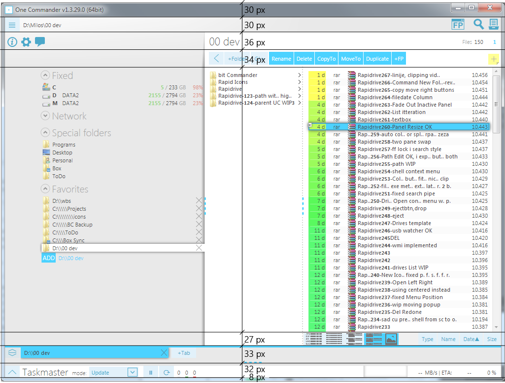
One of the biggest problem with One Commander I have recognized (and received complains about) is not enough vertical space for files. At the moment 230px of vertical space is unused.
On the height of 768px of 1024×768 screen:
- 5% Windows Taskbar
- 30% OC UI
- 65% File List
Starting from the top:
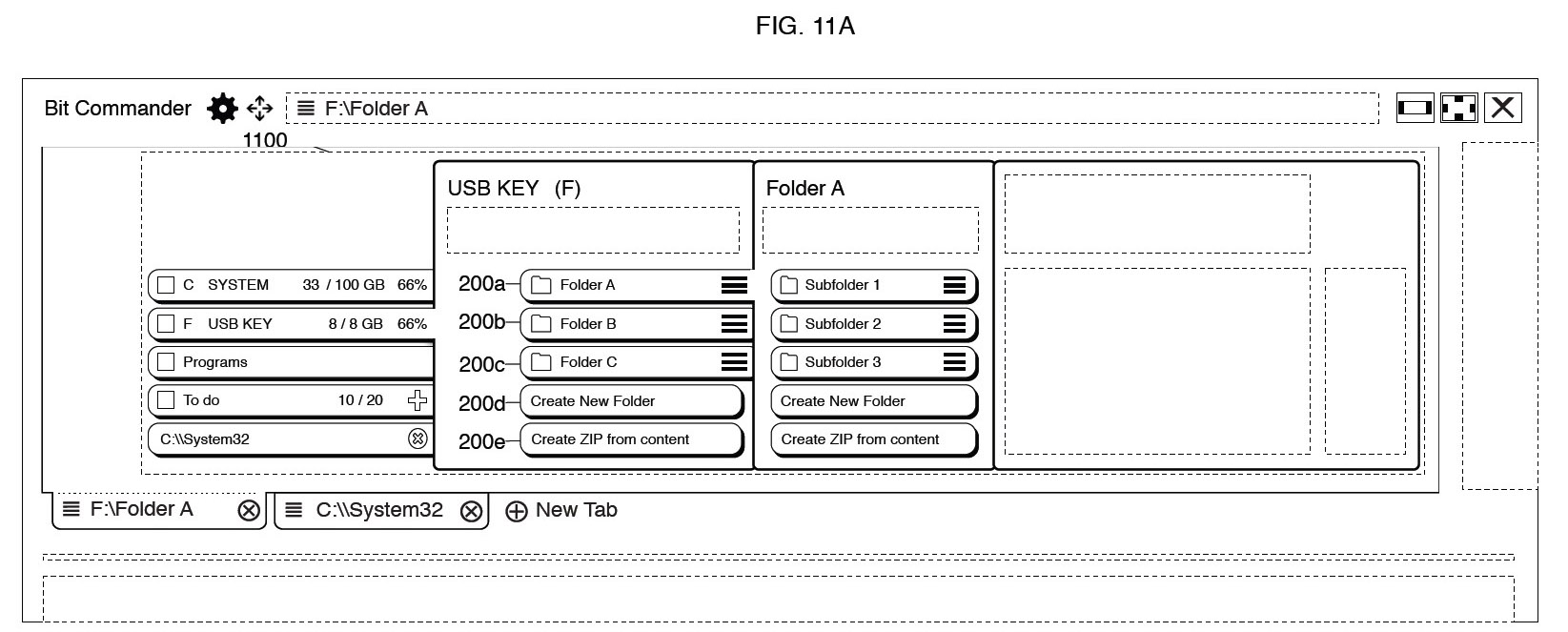
30px + 8px is window frame. The original idea of bitCommander was to merge Path + Messaging area + Droplist + Window controls into one line and still separate panel area to clearly show stacked relationship between panels (folder hierarchy), as can be seen in this early wireframe
One of the old version had it but Window’s does not treat non-native windows equally as regular windows. After many days of manually implementing snapping and other window actions, dealing with rendering glitches and different cases (aero/standard/win8/nVidia buttons…) I gave up on that idea and went the easy route and just added regular window. Many users also wanted native Windows look so that also influenced the decision to abandon the original idea.
The next 30px is shared by Current Path, Messaging area, File Processor launcher, Search and Drop List buttons. This space was also needed to show panels as separate visual entity.
36 px for Panel Titles, file count and a few window buttons. Even though it is necessary for multiple panels (user can use it as breadcrumbs, click to switch to that panel, or right-click to open context menu there), it still takes a lot of space for current panel. Panel titles can be merged with path and this is already set for v2, saving this screen area.
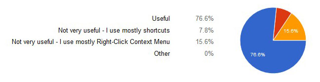
34 px for context sensitive buttons. So far with survey, 3/4 of users find them useful. I have realized that options were not formulated in the best way but it is still majority that use them. Buttons will be most likely kept but moved to the side.
27 px for View and Sort controls. Views have evolved in time and are rather similar now. Since 4th view did not exist at the time of making sort buttons, order of buttons has been adjusted to other views; and even these were different back then. Switching button order every time users changes a view would not make sense, especially since these were not aligned to the information columns anyway. This issue has been resolved in different way for v2. More information soon.
33 px for Tabs. Tabs have been originally placed at the bottom for several reasons:
- Easier access to touch
- Switching tabs using hand or pen does not cover affected area (panels)
- Only logical position from the design perspective, maintaining relationship between of folder panels (and without introducing another frame around browser component ‘1100’ in Wireframe)
62% of you agree on bottom tab position, and 7% would proffer them on side. Side tabs are great as more of them can fit while maintaining tab title readability. If you still don’t use vertical tabs in internet browsing I will recommend Tree Style Tabs Firefox extension.
Tabs are not really different that Favorites in drive list, except these are temporary. Do we really need to take 33px of space for them? Future of tabs in v2 is not yet determined, but functionality will be kept in one way or the other.
32 px for Taskmaster. This is a wasted space during time Taskmaster is idle. This issue has also been addressed by collapsing Taskmaster to 5px during that time.
More soon…