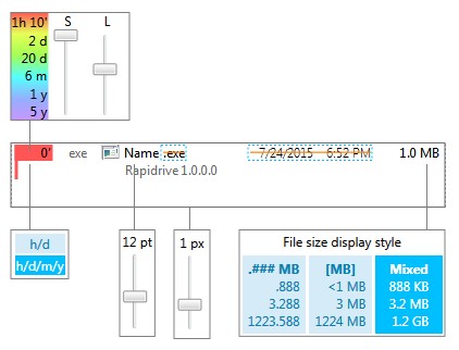
This is Work-in-Progress of the new Settings window. This time the approach is to make a more visual representation of the settings.
A survey that some of users have taken has shown that many have not explored settings window enough in OCv1. Survey has been presented only to the users who had more than 15 runs of program. The reason was to have only input from experienced users who already had formed the opinion on the UI. Even then, some features or changes have been requested that are already implemented and just had to be enabled in settings.
This was not very surprising as Settings window in v1 is quite verbal. I personally would rarely go through all settings in most programs so this was somewhat expected. Some users whose primary language is not English must have found difficult to understand all options. Making translation keys for all options and translating them would require a lot of efforts from program supporters around the world that have already translated majority of the UI to their languages. In addition, loading language keys is very slow and would add several seconds to the loading time and that was additional reason the another solution had to be found.
OCv2 will have more visual way of adjusting settings. Text will be omitted wherever possible. Multilingual tooltips will be provided on some controls.
A few times I have received a feedback that color of the File Age is too saturated so OCv2 has controls for that. One slider is for Saturation and second for Luminosity. Color transition is now exponential. For example: there is more color difference between 1h and 2h old file than between 3h and 4h old files.
